Ever wonder what inspired the artwork and graphics on your favourite pair of leggings?
This January, Dan Bolinski, a Designer for the Reebok CrossFit Collection, details how the Mix It Up print came to fruition.
Incorporating CrossFit culture into the print
Season after season, a big area of focus for us when it comes to designing CrossFit apparel is making sure that our prints and graphics resonate with the community. Yes, we want everyone who wears our apparel to look and feel great in it, but when designing pieces specifically for the Reebok CrossFit Collection, we also strive to incorporate elements that only individuals who do CrossFit will understand.
It’s a fun way of showing our connection to the sport and its athletes. This Mix It Up print unites quite a few of those elements into one design.
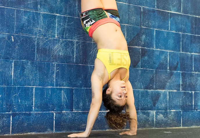
Within the print, you’ll notice a pig, representing the paleo lifestyle so characteristic of CrossFit athletes and specifically harping upon their love for bacon. There’s also a bear – inspired by the California state flag since Southern California is where CrossFit got its start – and an eagle – further expanding upon this “Americana” heritage.
Furthermore, there’s a black and white hand-drawn tattoo art section, because whenever you walk into a Box, it seems like everyone there has some sort of ink on them. And finally, the rip stop – the textured section of the print – is characteristic of a military fabric known for high-abrasion resistance, tying into the physical and emotional strength that one develops through CrossFit.

Same same but different in “Mix It Up”
Put on a pair of Mix It Up print leggings. Have your friend do the same. Compare the leggings once you have them on, and you’ll notice they’re different.
While the bear may cover a big section on the right leg for you, maybe for her, it’s on the left leg. We designed each section of the print on its own square fabric before putting them together and applying a ripping technique. As you rip and tear the fabric, you get very natural looking tears and weird shapes that give the print more movement and combine the separate sections in less of a striped, block manner.
The result? Whenever that ripped print is cut, it’s different. And so, no two pairs of leggings or shorts in this print are the same, a means of mixing up the normal design process where you’re typically aiming for all articles of clothing to look identical. From there, the “Mix It Up” name just stuck.

Source: Reebok


